Deep breaths. It’s really not that hard.
About five years ago I went to a crop at the former scrapbook store in town. The owner was impressed with how effortlessly I threw together a few patterns and came up with this layout:
My DH's baby pic. Isn't he a cutie patootie?
She asked me to teach a class. I was terrified. I never taught one before and I haven’t taught one since. I had two students. I think I learned as much as they did. That was back in 2005 but I think the same rules apply now as back then.
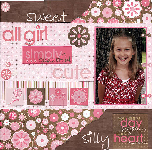
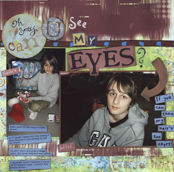
1. Find your base color. Most patterned papers will have a base of white or ivory. Keep it the same on the papers you choose for your page so they don’t clash.
2. Choose patterns that share a color. For example, make sure all your papers have a similar shade of blue. They can be darker or lighter but it looks best if they’re all the same shade (royal blue, teal, etc.).
3. Vary the patterns. Choose a mixture of polka dots, stripes, floral, checks, etc.
4. Vary the size of the patterns. Choose a small, medium and large pattern.
5. Use less of the large and more of the small. You don’t want the largest pattern to overwhelm the layout.
6. Separate the patterns. Ink or stitch the edges, run a piece of ribbon or a strip of cardstock between them, etc. This way the different patterns don’t blend into each other.
7. Use a kit or choose paper from the same brand/line. When they're packaged together or sold as part of a line, you know they’re meant to be used together. This tip is especially helpful if you're struggling to do it on your own.
Below are a few layouts I’ve done over the years. Some rules were bent a little (or a lot!). Then again, rules are made to be broken occasionally. Playing with patterns can be both fun and frustrating at the same time. Just relax, have fun and remind yourself that the world will not end if your layout isn’t perfect.
This is an older layout from 2006. I picked up the green in both patterns. See how well they work together?
These papers are from a Miss Elizabeth's pack of paper that I bought at Dollar Tree. I think I only used two sheets plus the patterned ribbon.
The paper on this last layout is from the Creative Imaginations Samantha Walker paper line. The stars on the upper right were cut from the patterned paper (another way to use large patterns!). The layout design was lifted from the Scrapbooks, Etc. 7/09 issue.
So, are you ready to tackle patterns?


1 comment:
I do mix my patterns but I usually count on buying a line of products that I like and mixing and matching from those. I guess I need to get a little more adventuresome huh?
Post a Comment